Collection Explore
Interview
Essay
Josh Faught
on Adding Flair to Sadness

On November 16, 2018, Skidmore students Evan Hasencamp ’20 and Julia Rinaolo ’19 interviewed artist Josh Faught about his work Housecleaning, 2009/2018, from the Tang Teaching Museum collection.

This interview was part of a series of interviews with artists conducted by Skidmore students in the Art History course “The Artist Interview,” led by Dayton Director Ian Berry.


Julia Rinaolo ’19
What is your first memory of art?

Josh Faught
The strongest memory I have of seeing art in a museum space was probably when I was in high school or junior high school and I went to the Tate in London. I saw this incredible exhibition of Mark Rothko’s paintings. And it was the first time that I ever felt truly emotional in front of a work. The lights were dimmed. These paintings glowed, and I sat there and just wept in front of this painting. It was a really beautiful, moving experience that I still can’t get out of my head.

Evan Hasencamp ’20
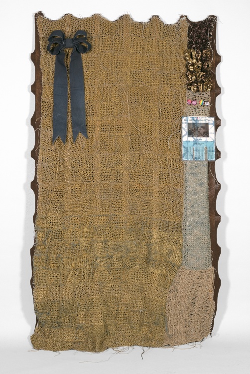
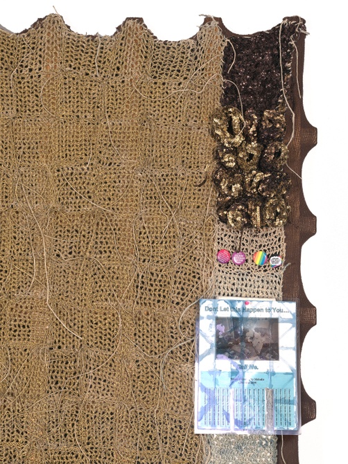
In terms of the materiality of your work, what brought you to combine so many different materials? You often combine painted elements or sculptural elements; in the case of Housecleaning, there are buttons, a flyer, and plaster.

JF
I’ve definitely benefited from looking at the work of other people. When I first started making work in textiles, I was highly influenced by the Art Fabric Movement of the 1960s and 1970s as well as the Pattern and Decoration Movement. I still am. These artists were thinking about textiles as surrogates for political activity or for a political spirit. By extension, I was thinking about feminist theory and queer theory and ways that I could merge or create a kind of historical fantasy around those works. I could think about if those works were made today, how would they look? How would they represent politics? How would they represent the ambiguity or the ambivalence of certain political ideologies?

And so that was where I got permission to make the work that I make, for lack of a better phrase. But there are so many different influences. Miriam Schapiro’s work is fascinating to me because it is really garish and really ugly and it stayed ugly for a long time. That is hard to do as an artist. It’s hard to make something that stays ugly for decades because trend has this way of turning everything around into something that’s beautiful or trendy or dazzling. I think that’s a strength of her work. I aim for some ugliness in my work. Part of my strategy as an artist is to try and make work that doesn’t look great on Instagram because I really believe in the importance of visiting artwork and experiencing it in real life and having a bodily relationship with an object. I always think that I’m not ready to let a work leave my studio until I’m embarrassed by it. That’s when it’s ready to go.

JR
I’ve never heard an artist say that before! How does your sexuality inspire the work that you make?

JF
I came of age during the AIDS crisis, and I was young enough that I didn’t know anybody that was dying, but I was old enough to think that if you came out as a gay man, you were signing your own death certificate. My family responded by saying, “We support you, but you’re going to die.” There was always this specter of death that was looming around queerness for me.

Now we’re in a different place in terms of how AIDS functions. It is a different conversation today than it was in the 1990s. A lot of the things that were created and the pop culture that dealt with queerness and gay male sexuality in the 1990s feels hopelessly out of date, but it really taught me to be who I am. I think about the construction of sexuality as it relates to a generation and to visibility or illegibility.

In my recent work, I’m thinking about modes of decoration and how they could be considered gay or queer. I found this book called The Unofficial Gay Manual that was printed in the mid-1990s. It’s a jokey, humorous book. It says every gay man should have a Sinead O’Connor cassette. It’s very tongue-in-cheek, but in the back of the book are legitimate social resources, financial resources, places where you can live if you get kicked out of your house, health resources. So it’s both earnest and snarky at the same time, and that’s a strange sentiment. In the middle of this book are gatefold images, hand-drawn illustrations of what a gay living room is supposed to look like, or a gay kitchen or a gay bedroom. And a lot of the things listed are things that, at this point, anybody would have in their house. It’s totally illegible from a contemporary standpoint. But at that particular moment, this was a process of signification of thinking about how objects or gay trappings speak to the inhabitant, how objects speak queerly. Now we’re in this place where I don’t know if there’s such a one-to-one signification anymore.

info Created with Sketch. plus Created with Sketch.
Josh Faught (born Saint Louis, Missouri, 1979)
Housecleaning, 2009/2018
hand-crocheted indigo-dyed hemp, machine-knit acrylic yarn, spray paint, political pins, laminated poster advertising housecleaning service, denim, sequins, garden trellis
Gift of Eileen and Michael Cohen
2018.1.62

JR
Can you tell us about Housecleaning?

JF
It was produced for my first solo exhibition in New York, at Lisa Cooley Gallery. The show was called While the Light Lasts, and the title was appropriated from a short story that Agatha Christie published in 1924. I was interested in this earnest, naive idea about staring out of your window watching the sun set and everything’s falling to shit around you—this idea that there’s something hopelessly romantic about your life falling to shambles, which is what happens in Agatha Christie’s stories. It’s normal people’s lives gone terribly awry, but there’s always this hazy, jolly vibe that’s tinged with manslaughter. I wanted to bring some of that weird atmosphere around Agatha Christie’s books into the work.

This particular piece began with a garden trellis, which is the armature that serves as a support. I made this piece during the market crash, and I liked the idea that the garden trellis was something that was immediate or urgent. You could stake the armature into your front lawn like a foreclosure sign, but then there is this other side of the piece that is labored and human and intimate, and that is the construction of the textiles, knit and hand-dyed, hand-crocheted hemp. It’s like a sweater fitting the body. The fabrics are actually smaller than the structure itself, so just like when you put on a sweater, it stretches around your body. I wanted that sense of a worn-out sweater, and that notion has been exaggerated over time.

I produced this piece in Eugene, Oregon, where I was surrounded by hippie shops and weed paraphernalia. The culture of hemp and cannabis was definitely all around me, but this material became really ubiquitous in Eugene. Eugene is a place where people pride themselves on their ability to disconnect from the rest of culture and where they create their own culture within this little bubble. On the one hand, it’s this place where you can learn all of these really esoteric textile techniques. I participated in this event called Fiber in the Forest where you learn how to indigo dye in the woods, which was incredible and special, but it’s also a place where people don’t want to have anything to do with anything that’s going on outside of Oregon. There’s a cageyness there. It’s also very self-helpy, and there are lots of bulletin boards all over the place.

I found this flyer in a weird waffle restaurant—very stoner food. This woman was advertising that she would help you clean your life up and do some housecleaning for you. It was on this bulletin board that I thought of as an abstract painting, with all these voices that were trying to speak at you, but collectively, they drowned themselves out. I wanted to recuperate that flyer and put it onto the piece, again, as this fast antidote to an otherwise slow process.

I started thinking about how I could queer this object. One of the first things that I thought of was pins or badges from the 1990s. It felt very daring to wear a gay pride pin, but it also felt like something you would wear if you worked at TGI Fridays. There’s this ambivalence: it’s flair, but it could easily say, “Ask me about my appetizers.” I liked that push and pull and how quick it is to put a pin onto something to claim your allegiance to something even though usually we feel messy about everything that we feel. I’m always thinking about how I can sabotage my own work. It starts in one tone, but then maybe the pins take it into another place.

I collect DIY pamphlets from the 1970s on how to make craft objects. It’s how I taught myself to make work in textiles on some level. There’s one on how to make denim bows, and I just thought everything needs a bow or a ribbon on it. It was a way to make this piece more festive when the fabrics are lethargic and sad. Everything is trying to bolster them back up, like the pins or the bow or the sequence that has been crocheted and then spray-painted. This piece initially was dipped in indigo dye, which has mythologies around sadness. I was thinking, how can I drown this piece in sadness and then put a polish on it?

info Created with Sketch. plus Created with Sketch.
Josh Faught (born Saint Louis, Missouri, 1979)
Housecleaning, 2009/2018
hand-crocheted indigo-dyed hemp, machine-knit acrylic yarn, spray paint, political pins, laminated poster advertising housecleaning service, denim, sequins, garden trellis
Gift of Eileen and Michael Cohen
2018.1.62

JR
When I first looked at this piece, I had no idea that it was dipped in indigo dye. You were saying that’s meaningful, but if it’s not seen directly by the viewer …

JF
I rely heavily on the materials list. I think the materials list is an amazing device for storytelling. I’m usually very descriptive with the materials. The worst thing I could ever imagine for my work is that there’d be a materials list reading “mixed media.” Instead, I want all of the lived histories of these materials to come forth. So I would say the piece is hand-crocheted, hand-dyed in indigo. If I’ve used cochineal dye, I’ll say, “cochineal made from ground-up bugs.” There’s storytelling that goes on within the materials list.

JR
Can you talk about the contrast between the title House­cleaning and the loose ends that you left on the piece?

JF
A lot of it has to do with my methodology in processing the work. My parents thought I was going to be a hoarder. Maybe I am a hoarder. I’m always building things back up and adding things to the surface of the piece, but there reaches a material tipping point where I start to feel really suffocated. And I’m like, “Oh, actually, no. I want to wipe everything clean and just have a textile.” There was a piece I made where I had wiped everything clean and it was mostly just hemp on a trellis with sequins, but then, inevitably, I started building it back up again. So I like using the term housecleaning as a way to imply hyper-embellishment instead of removal, which is what housecleaning typically suggests. Here, cleaning is about building things back up. I read this quote that housecleaning is the semiotics of boundary maintenance. I like that idea that you clean your house as a way to protect your boundaries. I’ve always thought that’s kind of magical.

JR
Can you describe how this work has changed over the past ten years since you originally made it?

JF
Housecleaning is part of a body of work that was about this idea of drooping or sagging. I would stitch things onto canvases and then they would, even by the time of the exhibition, start to droop and sag. I like the idea of these fabrics being weighty or having a relationship to gravity. This work is definitely a witness to that. The fabric was a bit higher before, and now it’s sagging. And when this piece arrived at the Tang Museum, the flyer wasn’t attached anymore; it had gone missing. At first, I was nervous about that. Most of the things added are one-of-a-kind originals. I started making copies of things because of this issue. That flyer was so important. I found a picture in my old iPhone photos that I took of the bulletin board in the waffle shop, but I couldn’t just print it out and make another flyer because it was a really bad image. I went into Microsoft Word and I meticulously matched all the fonts and remade this woman’s flyer. Then I laminated it and did this Japanese shibori method on the paper itself, and then dyed it again.

I felt like I enacted the same methodology on it that I did the first time around, which is asking, how can I wake this piece up? How can I make a party when there’s sadness? This new year is my way of responding to the aging of the piece. Maybe I should be alive forever so I can just keep adding things to the surface to liven it up. It’s part of that push and pull of something that’s hopeless and something that’s celebratory all at the same time.

JR
The original flyer was a white sheet of paper in a blue laminated sheet. This looks different. What are your ethics on changing your piece? Is it completely new now?

JF
I’m not quite sure, because this is actually the first time I’ve ever revisited a piece like this and actually made something new for the work that wasn’t there before. For me, it was a testament that this object is very much about the ideas that are here and the spirit of the piece more than it is about needing to look this exact same way. There’s this great book by Svetlana Boym about the future of nostalgia. And she divides nostalgia into two different types. There’s reflective nostalgia and restorative nostalgia. Restorative nostalgia is when you go to Colonial Williamsburg and everything is perfectly remade to go back to that time period, even if it’s totally inauthentic. And then there’s this idea of reflective nostalgia where you acknowledge the cracks in the sidewalk, you acknowledge age, and you respond to it in the present. You think about how the past influences the present. For me, it was this reflective notion of asking what this piece is really about. How can I respond to it and still complete the work? Even though what I made wasn’t what was there, it keeps the same spirit.

Josh Faught, a white, male artist, talking to two students who are facing away from the camera.
About Josh Faught
Josh Faught is a fiber artist whose work triangulates the space between textiles and sociopolitical and personal histories. He is associate professor and chair of textiles at the California College of the Arts and lives and works in San Francisco.

Cite this page

Faught, Josh. “Josh Faught on Adding Flair to Sadness.” Interview by Evan Hasencamp and Julia Rinaolo. Tang Teaching Museum collections website. https://tang.skidmore.edu/collection/explore/198-josh-faught. First published in Accelerate: Access & Inclusion at The Tang Teaching Museum 3 (2019).
i
Pattern as of Apr 24, 9:52:49 pm
daily on-campus page views: 354
daily off-campus page views: 545
current wind in Saratoga Springs: 6.4 mph, NE
Website design: Linked by Air